Sunday, June 1, 2008

Reflection

Finally, a look at what I got to see with my own two eyes that I never dreamed I would...

Laocoon (my favorite!!)

School of Athens by Raphael


The Colosseum


Venus de Milo


The Winged Victory of Samothrace


the tiny Mona Lisa

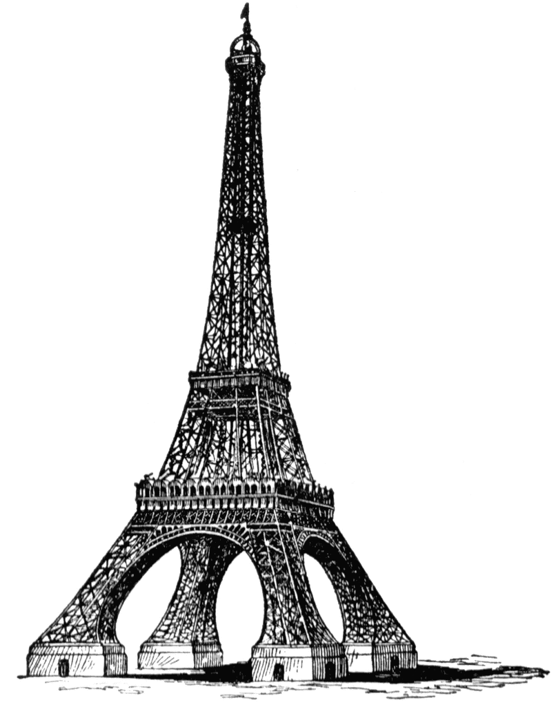
looking up the skirt of the Eiffel Tower (that's what it felt like)

BACK!!

Wow!! What a trip! In an effort to avoid more cliches, I am just going to post pictures.

Here are some examples of public art in Luzern, Switzerland.


not us, the fountain behind us :)


Notre Dame and the Eiffel Tower: Beauty and the Beast


Although the Notre Dame Cathedral and the Eiffel Tower are both icons of Paris, France, they were built during two extremely different time periods, resulting in different architectural styles, techniques, and responses from the public of France and the world…

The Notre Dame Cathedral was constructed as a replacement for the original Paris cathedral, which was deemed unworthy by Maurice de Sully, newly appointed Bishop of Paris and the designer behind the Notre Dame Cathedral. The original was therefore demolished, and new plans for a bigger, better cathedral took shape.

Notre Dame Cathedral was constructed in phases beginning officially in 1163 and finally completed in 1345. It was one of the first buildings to employ the techniques of flying buttresses, which are visible exterior supports for the walls. These were built because the walls were so heavy and exerting so much pressure they began to develop stress fractures. It is odd that the flying buttresses, used merely for strength and not visual appeal, are one of the most recognizable elements of design of the Notre Dame Cathedral.

Another famous attribute of the Notre Dame Cathedral is the stained glass windows, and more specifically, it’s rose windows (pictured). In places of worship, stained glass windows had 2 purposes: one, for beauty and light, but on a more practical note, to illustrate Biblical events and figures for illiterate people incapable of reading the Bible.

This structure is considered to be one of the finest examples of French Gothic architecture. However, this beautiful place of worship almost didn’t last. It suffered extreme vandalism and destruction during the French Revolution of the 1790’s, but was thankfully later restored.

Centuries later, another Parisian landmark was created: the Eiffel Tower. However, this was not meant for religious use at all; rather it was originally supposed to be a temporary monument for the World Fair.

Designed by Gustave Eiffel and built between 1887 and 1889, the Eiffel Tower (pictured) is perhaps the most controversial of French structures. Eiffel was highly criticized for the “daring shape” of the Tower, which was originally labeled as an unnecessary eyesore for the people of Paris. It is ironic how now it is one of the most recognized and visited monuments in the world today.

The shape of the Eiffel Tower was carefully calculated as an exponential curve designed to be the most wind-resistant. Built of iron and rivets, the structure weighs in at 10,000 tons, and is has a surprisingly low density thanks to the brilliant engineering of Gustave Eiffel.

When it was completed, it was the tallest tower in the world, equivalent to 81 stories, only to be surpassed by the Chrysler Building in New York City in 1930.

It is strange how two monuments of Paris, one held high in religious awe and grandeur, and the other bemoaned by its neighbors as a visual disaster, both have become two of the most famous examples of fantastic architecture in France, and the modern world.


Architecture Terms and Examples

Post and Lintel: two vertical uprights support a horizontal beam (lintel)
ex. Eiffel Tower

Coffers: the parts in a ceiling that are recessed
ex. St. Paul's Cathedral

Arch (round and pointed): opening with a curve at the top
ex. Coliseum

Pediment: a low triangular gable on a sloping roof
ex. Les Invalides

Baroque facade: the front of a building constructed in the baroque style, full of granduer
ex. Houses of Parliament

Dome: a upside-down concave architectural element
ex. Duomo

Oculus: circular window, usually at the top of a building to let in light
ex. Baptistry

Barrel vault: a vaulted ceiling, creating the appearance of a dome
ex. Louvre

Stained glass windows: colored glass in windows often depicting religious events
ex. Notre Dame Cathedral
Steel construction: building with the alloy of steel
ex. Eiffel Tower

Interview with Leonardo


I must have a better reputation than I thought, because somehow I got Leonardo Da Vinci to agree to a casual interview with me. I am so excited and anxious; what a genius and what an opportunity! After doing a bit of background research, I am very intrigued by the quirky tidbits I have gathered about his life and his work, and cannot wait to hear his opinions.
We agreed to meet at Trafalgar Square in London, and conduct our conversation while walking around London’s National Gallery of Art. I was surprised at how open he was to leaving his native Italy, but I guess that just confirms his supposed charming nature.
Preparing for the barrage of questions I yearned to throw his direction was excruciating. A once in a lifetime chance as this, I didn’t want to leave any area untouched. I decided to start the conversation off with examples of things we had in common (trivial things, of course; by no means do I have any right to compare myself to this archetypal Renaissance man), I just wanted to create rapport. When we first met outside on the steps of the museum, he appeared to be a lot older than his final age of 67, which I guess is why there is speculation about his red-chalk self portrait. But there he was, standing in front of me, clear as day.
I introduced myself and told him one of the main reasons I wanted to bring him here today was that I had previously analyzed his Virgin of the Rocks painting, and was curious about his thought process that drove the piece. I also wanted to get a glimpse of what he thought of modern life, especially since it gave birth to many of the inventions he documented, such as a primitive helicopter and tank, as well as detailed studies of human anatomy.
As we walked through the museum, he seemed pleased that a lot of his scientific ideas had taken off now, even if they were somewhat of a flop during his era. I got the feeling that he had much better social skills and interactions with people than his sour peer, Michelangelo, although I didn’t dare mention it. We made small talk, sharing the fact that we are both left-handed and vegetarian, although the term for it wasn’t around during the Renaissance, and made a little joke about how Italian cooks are awful at preparing dishes without meat. I suggested he visit France instead, and he smiled.
We finally came to Virgin of the Rocks, and I asked him how he felt about having his work here for everyone to observe. He didn’t seem to mind, although he admitted he was more a private person. He was grateful for the attention though, and joked that he should’ve finished more of his projects. I chimed in that we shared the gift of procrastination, as well. I asked him to describe his painting for me, what he was thinking and feeling and what his intentions were, so I could truly gain insight to his artistic genius. I have never been so overwhelmed in my life. I was scratching his comments down on my notepad, but was frozen in awe as he so methodically dissected his work, as if it were another cadaver. I could not even repeat half of what he said, but I remember him saying how the pyramid shape he used to guide the eye between the figures was incredibly calculated, along with dozens of other tiny details that most people don’t even notice. In the middle of his explanation, I realized my mouth was gaping and quickly closed it.
As we exited the museum and parted ways, I graciously thanked him for his time and conversation. As I watched him walk away, it was obvious how he still seemed to march to the beat of his own drummer, and it made me smile. After all, the Renaissance encouraged that anyway.

Friday, May 30, 2008

The National Gallery of Art- London


The National Gallery in London originally began as a purchase of the art collection of a prominent banker by the House of Commons in order to establish a collection for all to enjoy. In the beginning, the organization of the new National Gallery was poor under the guidance of the first Keeper, William Seguier. After the government stepped in and made reforms, the Gallery highly improved. A site was selected in Trafalgar Square in London to construct a permanent place for the gallery that was easily accessible by carriage for the rich and by foot for the poor. Now the National Gallery in London prides itself on education and its free admission for all.


Leonardo Da Vinci's Virgin on the Rocks (below) is a great work for analysis. The layout and composition is absolutely brilliant. Notice how your eyes moves around the piece. It starts on the glowing face of Mary, whose hand guides you down past the angel to the Christ child, whose raised, outstretched arm that is blessing St. John the Baptist directs you towards him, and then St. John's praying hands lead right back up to Mary.
All of the figures have a distinct volume to them. Every one of them has flesh that looks tangible and 3-D, thanks in part to Da Vinci's expert shadowing techniques. As far as light and contrasts, note how their holy faces are lit up and stand out shockingly from the background, even from Mary's robes. There is an obvious religious emphasis here; not only does highlighting their faces establish their importance, it also gives them a very innocent, divine nature.
Da Vinci's color schemes are usually not the brightest, but observe the bold jewel tones of Mary's robes and and the deep warm browns of the background. This creates a certain warmth that goes along with the religious content. Think about it: this exact same scene, figures surrounded by jagged rocks, painted in a cool color scheme would look gloomy, depressing, and frightening. However, Da Vinci's use of bold yellows and blue, albeit sparingly, set the mood as warm and comforting.
Although the space and perspective is not quite as accurate as paintings later on, it is still very easy to see that Chirst is in the front, before all of the other figures. Also, everyone else is facing out towards the Christ child, further establishing his position among them. That segues into the next element: line. The angles of the limbs and bodies of the figures are at soft diagonals, giving the feeling of smooth energy without making them stagnant and emotionless. Combined with their soft shapes and curves, Da Vinci achieves a feeling of contentment for the viewer gazing at this scene. The principles of soft diagonal lines and smooth shapes also apply to the rock formations in the background.
The negative space between the rock formations acts to balance out and shed light on the postive space of the figures in the foreground so the final piece does not appear to crowded and heavy, losing its soft, etheral appeal.


Formal Elements of Art

Composition:
Composition is basically evaluating how the entire piece is put together (where your eye goes) and how that impacts the final result that the artist intended.

In Da Vinci's The Last Supper, he uses triangular relationships to guide the eye and emphasize Christ. Note the triangle of Christ's head and hands, as well as how the walls and ceiling all point towards the center.

Volume (mass,weight):
Volume relates to the depth of items in the piece and the emphatic purpose behind the technique.


In Michelangelo's Pieta, the sheer weight and mass of Christ on Mary's lap is truly believable. Note her hand under his shoulder and how it appears that she really is holding him up as his head is rolled back and arm hung loosely.

Light (contrast):
Lighting, in any type of media, is absolutely key in relaying appropriate responses to the piece (somber, anxious, warm, etc)

In Caravaggio's Doubting Thomas, notice how the source of light is very dim, creating a somewhat tense and somber mood, highly appropriate for the situation depicted, but that most of the light that is present falls on Christ, emphasizing him and his importance.


Color:
Color schemes and choices are often taken for granted, but in fact they are very calculated and play a big part in setting mood of the piece.


In Monet's Water Lily Pond, the color scheme of yellows, greens, teals and grays conveys a very tranquil atmosphere.


Space:
Spacial standards have been different according to the time period (ie. Rennaissance) but space contributes to the realism of the piece and also helps the artist with emphasis.

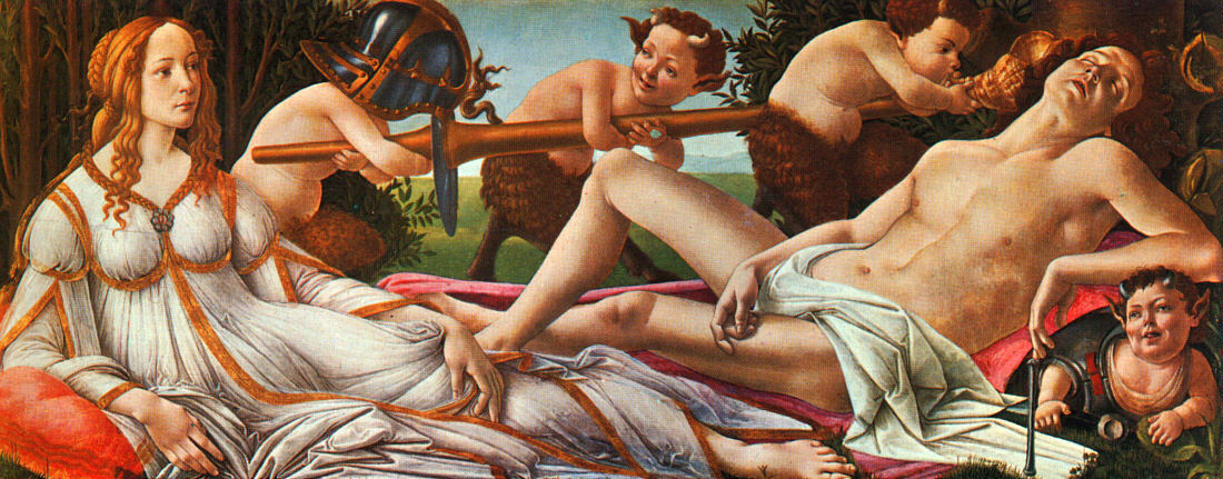
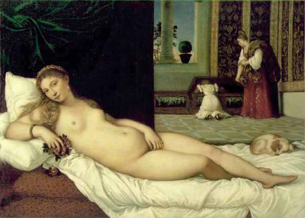
In Titian's Venus of Urbino, space and perspective are a bit confusing. Observe how it is hard to tell how far away the window is from the woman in the background, and how far she is from the dog curled up, and how far that dog is from Venus.


Line:
Another aspect of art that is often overlooked, the slightest difference in the angles or formations of the lines in a piece can drastically alter the energy the artist was trying to convey.

In Bernini's David, notice the drama and tension created by his diagonal body and legs, with his arm crossing over his torso. The angle of his limbs gives off a burst of energy, like we are seeing him coiled up, ready to spring.


Shape:
Shape, along with line and color, also helps with energy and emotion.


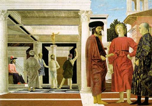
In Francesca's Flagellazione, the shapes used are very neat and precise, such as the ceiling and pillars very straight and square appearances. Even the poses of the figures are mostly stiff looking. However, there are certainly an abudance of shapes present in this piece, it's just too bad that they don't elicit more of a reaction.


Positive/Negative Space:
Positive and negative space are key when the artist is trying to emphasize a certain area of the piece or elicit a certain response from the viewer.

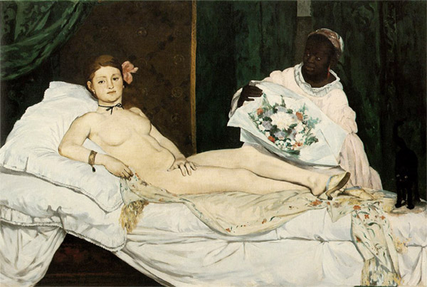
In Manet's Olympia, her body, the bed she is posing on and the figure of her servant all have detailed shape; however, the walls in the background all blend together and don't feel tangible like everything else does, fading into negative space to further emphasize the subject.