The National Gallery in London originally began as a purchase of the art collection of a prominent banker by the House of Commons in order to establish a collection for all to enjoy. In the beginning, the organization of the new National Gallery was poor under the guidance of the first Keeper, William Seguier. After the government stepped in and made reforms, the Gallery highly improved. A site was selected in Trafalgar Square in London to construct a permanent place for the gallery that was easily accessible by carriage for the rich and by foot for the poor. Now the National Gallery in London prides itself on education and its free admission for all.


Leonardo Da Vinci's Virgin on the Rocks (below) is a great work for analysis. The layout and composition is absolutely brilliant. Notice how your eyes moves around the piece. It starts on the glowing face of Mary, whose hand guides you down past the angel to the Christ child, whose raised, outstretched arm that is blessing St. John the Baptist directs you towards him, and then St. John's praying hands lead right back up to Mary.
All of the figures have a distinct volume to them. Every one of them has flesh that looks tangible and 3-D, thanks in part to Da Vinci's expert shadowing techniques. As far as light and contrasts, note how their holy faces are lit up and stand out shockingly from the background, even from Mary's robes. There is an obvious religious emphasis here; not only does highlighting their faces establish their importance, it also gives them a very innocent, divine nature.
Da Vinci's color schemes are usually not the brightest, but observe the bold jewel tones of Mary's robes and and the deep warm browns of the background. This creates a certain warmth that goes along with the religious content. Think about it: this exact same scene, figures surrounded by jagged rocks, painted in a cool color scheme would look gloomy, depressing, and frightening. However, Da Vinci's use of bold yellows and blue, albeit sparingly, set the mood as warm and comforting.
Although the space and perspective is not quite as accurate as paintings later on, it is still very easy to see that Chirst is in the front, before all of the other figures. Also, everyone else is facing out towards the Christ child, further establishing his position among them. That segues into the next element: line. The angles of the limbs and bodies of the figures are at soft diagonals, giving the feeling of smooth energy without making them stagnant and emotionless. Combined with their soft shapes and curves, Da Vinci achieves a feeling of contentment for the viewer gazing at this scene. The principles of soft diagonal lines and smooth shapes also apply to the rock formations in the background.
The negative space between the rock formations acts to balance out and shed light on the postive space of the figures in the foreground so the final piece does not appear to crowded and heavy, losing its soft, etheral appeal.

 In Da Vinci's The Last Supper, he uses triangular relationships to guide the eye and emphasize Christ. Note the triangle of Christ's head and hands, as well as how the walls and ceiling all point towards the center.
 In Caravaggio's Doubting Thomas, notice how the source of light is very dim, creating a somewhat tense and somber mood, highly appropriate for the situation depicted, but that most of the light that is present falls on Christ, emphasizing him and his importance.
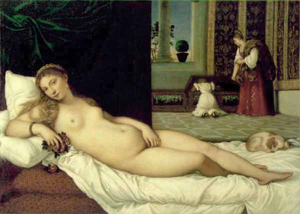
 In Titian's Venus of Urbino, space and perspective are a bit confusing. Observe how it is hard to tell how far away the window is from the woman in the background, and how far she is from the dog curled up, and how far that dog is from Venus.
 In Bernini's David, notice the drama and tension created by his diagonal body and legs, with his arm crossing over his torso. The angle of his limbs gives off a burst of energy, like we are seeing him coiled up, ready to spring.
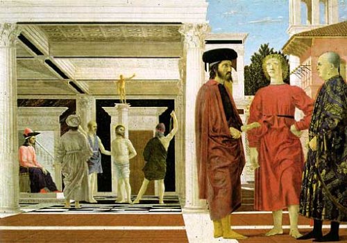
 In Francesca's Flagellazione, the shapes used are very neat and precise, such as the ceiling and pillars very straight and square appearances. Even the poses of the figures are mostly stiff looking. However, there are certainly an abudance of shapes present in this piece, it's just too bad that they don't elicit more of a reaction.
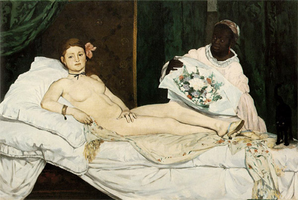
 In Manet's Olympia, her body, the bed she is posing on and the figure of her servant all have detailed shape; however, the walls in the background all blend together and don't feel tangible like everything else does, fading into negative space to further emphasize the subject.